Portfolio rebranding
An ongoing project that began during my time at university, where I was originally tasked with creating a four-page portfolio. Since then, I have rebranded and redesigned my site twice to achieve a more modern and visually appealing look, continuously improving its design and functionality. I have also added more examples of my work as my career has progressed.
Variation 1
Created in 2017 this university project consisted of three key phases.
Planning: This project began as part of a university module, which came with a clear brief that needed to be met. The requirements included creating a four-page website, implementing at least one JavaScript element, and ensuring the entire site was fully responsive across devices. These requirements influenced both the layout and the decisions made during the design phase of the project.
Designing: Using Sketch, I created low-fidelity wireframes to ensure the requirements of the brief were met, while defining the core structure of the website and visualizing its appearance on both desktop and mobile. The design included four main pages: a Home page featuring a hero image, a Contact page with a form for users to reach out, a Portfolio page showcasing projects completed during my time at university, and a Photography page with a sliding gallery to fulfill the JavaScript functionality requirement. From there, I refined the layout by adding actual content and progressed to medium- and high-fidelity designs, bringing the concept closer to its final form.
Building: Finally, it was time to bring the designs to life. I hand-coded the website using HTML, CSS, and JavaScript, following my designs down to the pixel to ensure accuracy and consistency. This process resulted in the creation of my very first portfolio site, fully responsive and meeting the requirements of my unit brief.
Variation 2
Fast forward to 2019: I had graduated from university and was eager to land my first industry-related job. However, I didn't feel confident applying for roles using the website I had created during my studies. It was time to give my original site a complete overhaul.
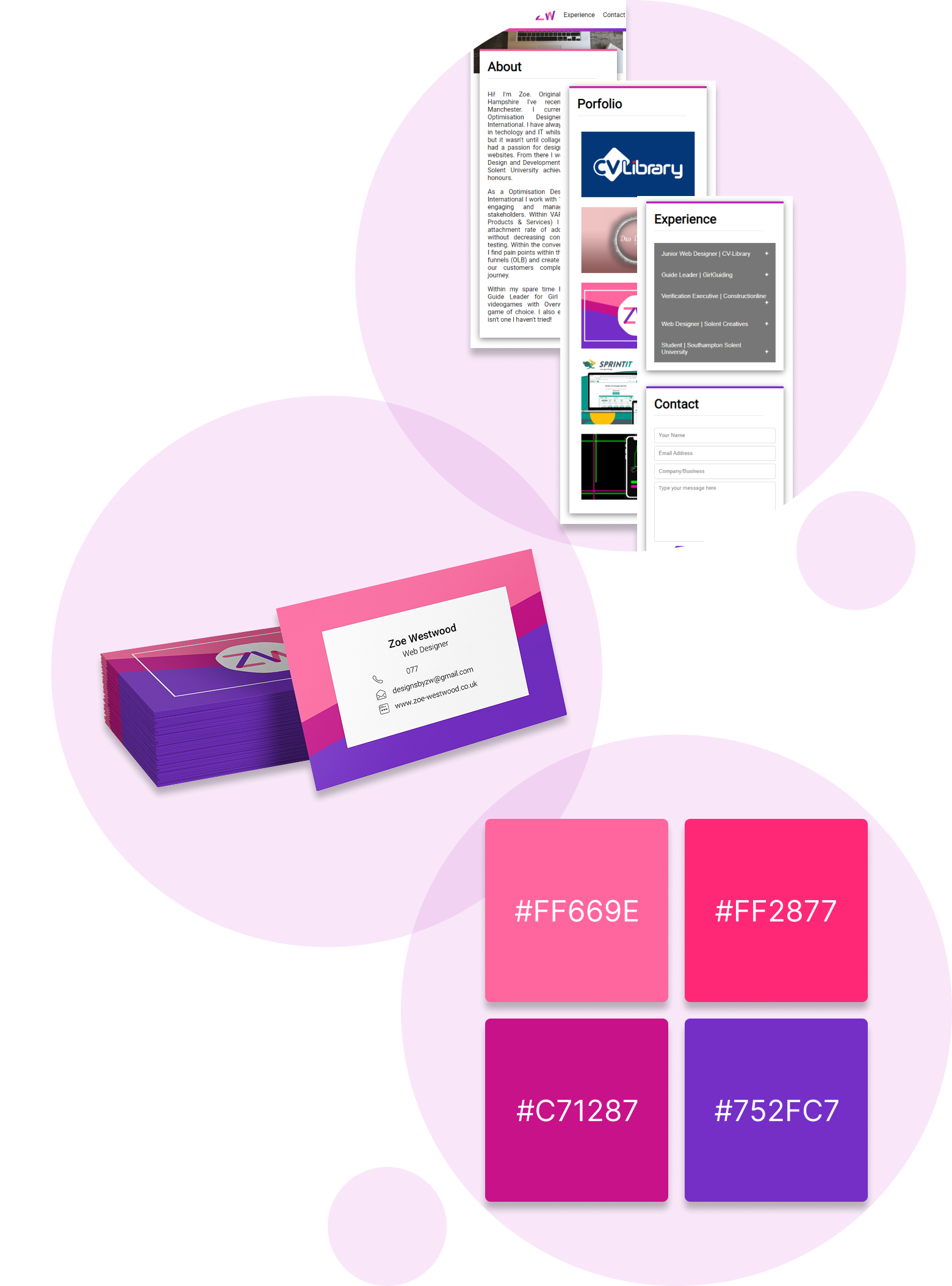
Planning: Since my goal was to secure an industry-related job as quickly as possible, I decided to create a simple one-page website with fewer sections. This approach would reduce development time and allow for quick implementation. I also wanted my website to have its own web address, which meant exploring domain purchase and online hosting. At the time, I had little knowledge of how hosting and domains worked, and I wasn't sure how many pages I could include without incurring extra costs. This uncertainty was another reason I opted for a single-page design.
Designing: concept was simple, and with a clear vision and most of the content ready, I moved straight into the design phase. I wanted to give the website a completely new brand identity by introducing fresh colors and a logo. To keep the branding minimal, I chose to use my initials as the logo. For the color palette, I selected my favorite colors and incorporated them into the design, overlapping them to create blended tones and alternative shades. These variations were then used throughout the website as accent and highlighting colors. I also designed and printed my own business cards, preparing for the possibility of taking on freelance work if I couldn't secure a role quickly.
Building: With the designs complete, I quickly coded the one-page website, purchased a domain, and hosted the site via GitHub Pages. Once everything was live and functioning as intended, I was ready to start applying for roles.
Variation 3
My most recent design, the website you're currently using, is a major step forward compared to my earlier single page site.
Planning: The planning phase was more involved than my previous attempts. A major issue with my earlier website was the heavy reliance on third party links to Behance, Dribbble and GitHub. None of my actual work was available directly on my website you had to leave the site and come back, which disrupted the experience. I knew this new version needed stronger structure and multiple pages to properly showcase my portfolio in a more professional and self contained way. While I wanted to keep the overall colour palette from the previous version, I chose to tone the colours down to maintain a clean, modern aesthetic. This time, I focused on designing a more complete website that could grow with my work.
Designing: I created the initial designs in Figma, and once I established the layout and key components, the rest of the design process came together quickly. Reintroducing multiple pages made sense to keep everything organised and easy to browse. I refined the layout to be simple and intuitive, with bold headings, subtle colour highlights, and a clear flow between text and imagery. After finalising the designs, the next challenge was determining the best way to bring the site to life and make it accessible.
Building: Initially, I planned to have a friend code the website for me, since development is not my favourite part of the process. However, due to their own commitments, that plan changed, and I began prototyping the site myself in Figma. The prototyping tools allowed me to simulate button interactions, header animations, and title underlines, but the free plan quickly limited my options and did not match the level of ambition I had for the project. Ultimately, I decided to hand code the entire website myself. This gave me complete creative freedom and ensures I can maintain and update it as much or as little as I want moving forward.